Energy markets are awash with charts. We work in a data intensive industry and a good chart can be worth a thousand words. But charts by nature provide a static view of factors such as price, volume, value & risk.
Chart animation adds an additional dimension: time. That can help a lot with interpreting the dynamic evolution of market prices and let’s face it, everyone likes a trip to the movies.
Today we animate the evolution of NBP gas prices. We’re no threat to Pixar, but the animation supports some interesting takeaways on current gas pricing dynamics.
The NBP snake
Chart 1 shows the simultaneous evolution of NBP spot and forward gas prices. The strong arbitrage driven relationship between NBP and TTF means that many of the characteristics of this animation apply for TTF also. But we’ve chosen NBP rather than TTF to focus on some recent pricing dynamics that are specific to the UK.
Chart 1: NBP gas curve animation (2010-18)
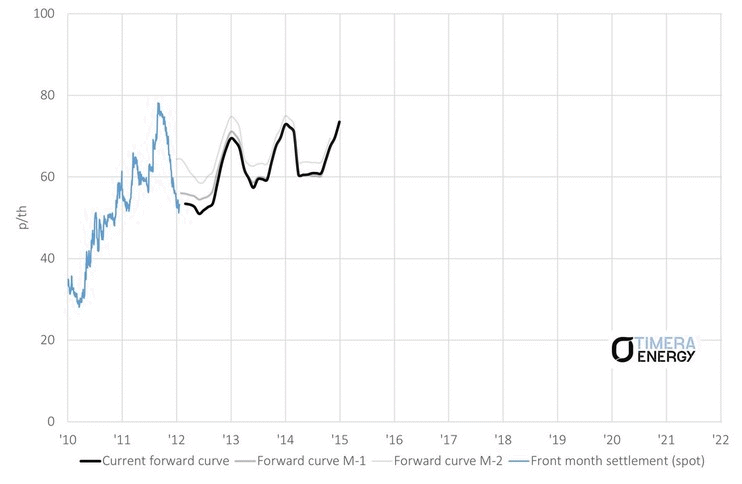
Source: Timera Energy (based on ICE data)
Some takeaways to consider
-
- Spot vs forward: there is a very strong relationship between spot prices (we’ve used month-ahead prices in Chart 1) and shifts in the forward curve (‘spot wagging the curve’), although this can break down in periods of more extreme spot price stress.
- Winter 17/18: NBP month-ahead prices took off in Dec 17 due to a combination of supply outages and uplift from high spot LNG prices given strong Chinese demand for spot cargoes. However the ‘beast from the east’ day-ahead and within-day spikes in Feb 18 had very little impact on forward prices (given short term weather driven nature of the shock).
- Seasonal spreads: UK seasonal spreads can be seen roughly doubling from 2016-18 (4 to 8 p/th) to induce more supply flex since the closure of Rough. Front year spreads can be very volatile as spot prices move.
- Recent spot price ramp: European near term gas prices are again being pulled higher by rising coal prices in Q2 2018. Higher coal prices lifts gas for coal plant switching levels in the power sector which provides support for gas prices.
- Current backwardation: European gas curves (like the Brent crude curve) are also moving into strong backwardation which is relatively unusual for gas. This is due to a combination of (i) rising spot prices and (ii) the looming ramp up in surplus LNG acting to dampen forward prices across 2019-21.
The other important thing to note is that current NBP/TTF forward curves are consistent with Europe comfortably digesting surplus LNG this decade (at annual prices above 6 $/mmbtu). European hub spreads vs US Henry Hub (3-3.50 $/mmbtu) are well above the variable costs of flowing US exports to Europe. The Q1 2016 price slump has so far been the only time when the trans-Atlantic spread declined to levels that threaten US shut ins.
We will be back soon to revisit how Europe can digest surplus LNG via gas vs coal switching and the associated impact on hub pricing dynamics.