The wild ride continues in the crude market. Brent plunged below 30 $/bbl earlier this month as resilient production and inventory build spooked the market. This was followed by a sharp 20% rally triggered by the optimistic concept of coordinated OPEC/Russian production cuts.
Any hope of cooperation between Saudi Arabia, Iran and Iraq fell apart last week, with crude falling 5% in a day. But prices snapped back after better than expected gasoline inventory data. The oil market is being whipped about by short term news flow.
Much of this would appear to be of little relevance to longer term prices. But the crude forward curve is also gyrating wildly with fluctuations in spot prices. The crude curve deserves more attention than it gets. For a meaningful bottom to form in the crude market, the US production investment cycle needs to be disrupted. And forward prices are a key benchmark driving the investment decisions of US shale producers.
In this article we return to an updated view of our animation of spot vs crude curve evolution for clues on the evolution of crude pricing dynamics. We also take a look at the behaviour of implied volatility levels in relation to underlying prices.
Back to the movies
We published our first animation of Brent curve evolution in Feb 2015. Chart 1 shows an updated view of the animation a year on.
Chart 1: Brent spot versus forward curve evolution (2008-16)
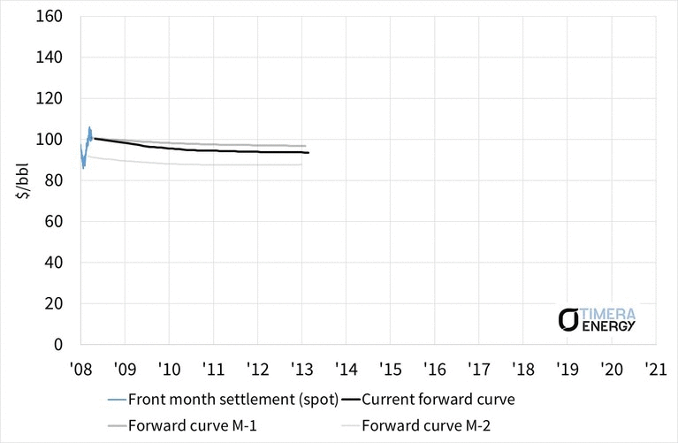
Source: Timera Energy, ICE data
Perhaps the most striking observation from Chart 1 is the strong relationship between spot prices and the forward curve. But some other interesting dynamics can be observed by focusing in on the back end of the curve:
- Financial crisis shock (2008-09): Although spot prices fell below 40 $/bbl, the back of the curve remained above 65 $/bbl.
- Recovery (2009-13): The back of the curve was anchored in an 80-100 $/bbl range (driven by production LRMC benchmarks), despite spot prices moving in a much wider band.
- Oversupply down leg 1 (2014-15): Spot prices plunged under 50 $/bbl in early 2015, but the back end of the curve remained above 75 $/bbl (again held up by production LRMC benchmarks).
- Oversupply down leg 2 (2016- ): In 2016, the back end of the curve has fallen below 50 $/bbl, significantly lower than previous periods of low spot prices.
Oversupply remains pronounced in the short term, with a large global inventory overhang. But in 2016 the forward curve is at levels that do not support new investment in US shale. In other words forward prices are below the Long Run Marginal Cost of shale production (let alone other supply sources). This is illustrated by an ongoing decline in the US rig count. These conditions are supportive of a market bottom and price recovery, even if there may be further short term weakness in spot prices.
There are two other important factors to watch for clues on a market bottom:
- A weakening in the US Dollar, given the negative correlation between oil and the USD
- Extreme levels of implied volatility in the crude options market
Chart 2 shows the evolution of the CBOE 30 day implied volatility index (OVX) over the same 2008-16 period as Chart 1.
Chart 2: CBOE OVX crude oil volatility index
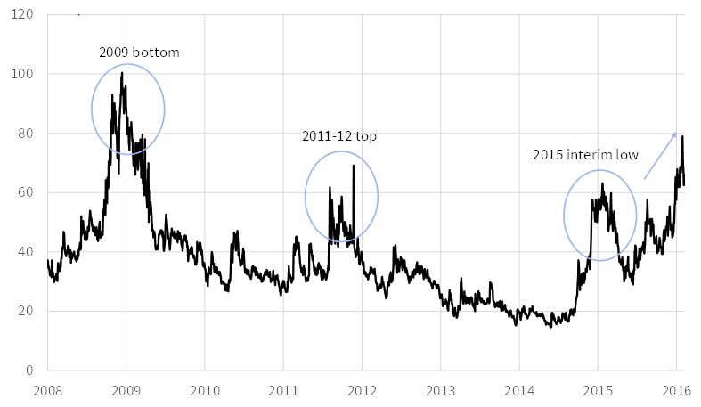
Source: Timera Energy, CBOE data
It can be seen from Chart 2 that major market turning points coincide with peaks in implied volatility:
- Financial crisis low (2008): A peak in the OVX implied volatility index above 100 coincided with the post financial crisis low below 40 $/bbl in late 2008
- Recovery top (2011): Another peak above 60 occurred in the OVX at around the time Brent spiked above 125 $/bbl in 2011.
- Interim low (2015): The OVX again breeched 60 as Brent formed a temporary bottom below 50 $/bbl in early 2015.
The logic is fairly simple. Market trends tend to reverse during periods of extreme sentiment and uncertainty. This is reflected by high premiums being paid for protection via the options market causing a spike in implied volatility.
Early in February, the OVX spiked towards 80 indicating another period of extreme implied volatility. This does not preclude volatility moving higher still (e.g. towards 100 as in 2008). But it does suggest that the crude market could be in the process of forming a major low.
Article written by David Stokes, Olly Spinks and Emilio Viudez