Averaging wind and solar output volumes reveals some structural patterns. Wind output tends to be higher during the day time than at night and has a seasonal profile. Solar output is also seasonal with a strong linkage to daylight hours.
But analysing power markets based on average conditions, understates the true impact of system intermittency on market prices. Around these averages sits a wide and growing distribution of wind & solar output uncertainty.
This uncertainty needs to be captured in order to understand power asset value & quantify value capture. In this article we look at:
- The impact of wind & solar intermittency on power market supply stacks and
- How to quantify volume distributions of wind & solar output swings.
How intermittency impacts the supply stack & prices
Power price uncertainty has traditionally been driven by swings in demand and fuel prices. While these factors remain an important influence, they are set to be overtaken by swings in wind & solar output.
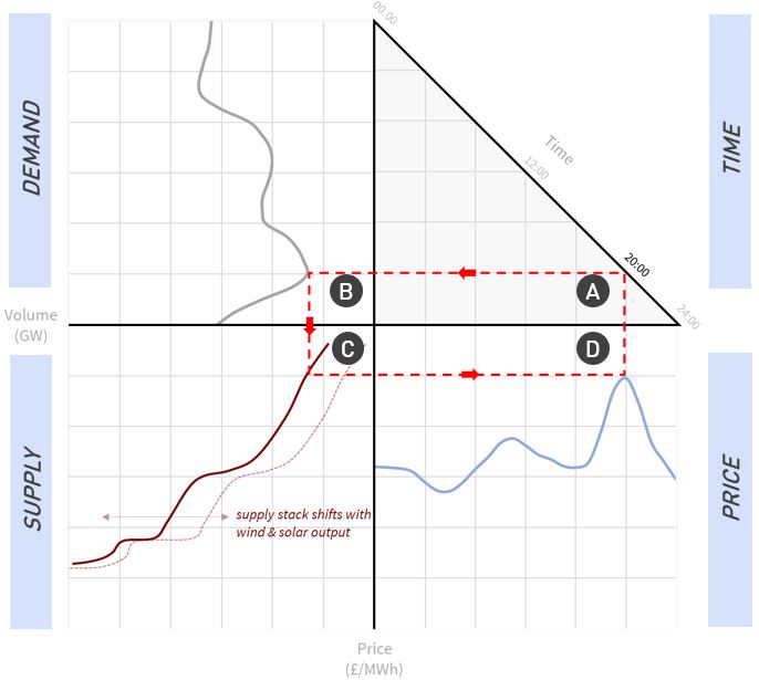
Chart 1 illustrates how these forces combine to drive price:
- For a given time of the day (e.g. 20:00)…
- System demand is determined by factors such as weather…
- The positioning of the supply stack to meet that demand depends on prevailing wind & solar output…
- The marginal unit required to meet demand drives system price.
As wind and solar capacity grows, so to do the swings in the supply stack (right & left) as output continuously expands and contracts. These swings in the supply stack (in combination with load swings), act to drive power price volatility.
Quantifying wind & solar swing: UK case study
While Chart 1 helps conceptualise the impact of wind & solar swings, it does not help quantify how large these swings may be. We address this in Charts 2 & 3, using the UK power market as a case study.
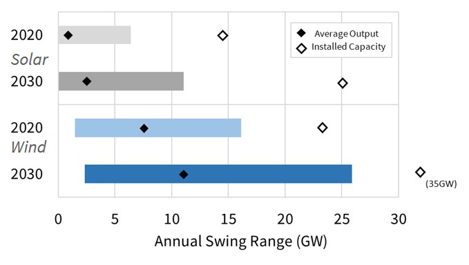
Chart 2 illustrates the estimated annual swing range distribution for solar & wind across all half hours of the year in 2020 versus 2030:
- The shaded bars show the 5th – 95th percentile annual output ranges (across all half hours)
- The black diamonds show average annual output (across all half hours)
- The white diamonds show assumed total installed capacity
For example, Chart 2 shows that by 2030, wind output may range across the year from as low as 2GW (5th percentile) to 26GW (95th percentile). These ranges are useful in understanding how intermittent supply can vary across a medium term horizon. But it is the intraday swings of wind & solar that are key drivers of short term price dynamics (e.g. volatility) and the value of flexible power assets (e.g. gas-fired plants, storage and DSR).
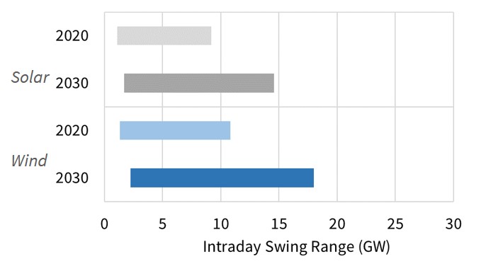
Chart 3 illustrates the 5th – 95th percentile intraday swing ranges for wind and solar output. Stepping down the time window from a year to a day (i.e. Chart 2 to Chart 3), does not actually reduce the swing ranges by that much. For example the estimated 2030 intraday wind output range is 2GW (5th percentile) to 18GW (95th percentile).
These large and growing gyrations in power market supply stacks are underpinning the formation of market prices. Capturing the associated uncertainty should be ‘front and center’ in any analysis of asset value and how that value can realistically be captured.