Energy markets are awash with charts. We work in a data intensive industry and a good chart can be worth a thousand words. But charts by nature provide a static view of factors such as price, volume, value & risk.
“Watching the forward curves evolve is a bit like peering into a pit of writhing snakes…
…but it provides some very valuable insights”
Chart animation adds an additional dimension: the evolution of price behaviour through time. That can help a lot with interpreting the dynamic evolution of market prices and let’s face it, everyone likes a good movie.
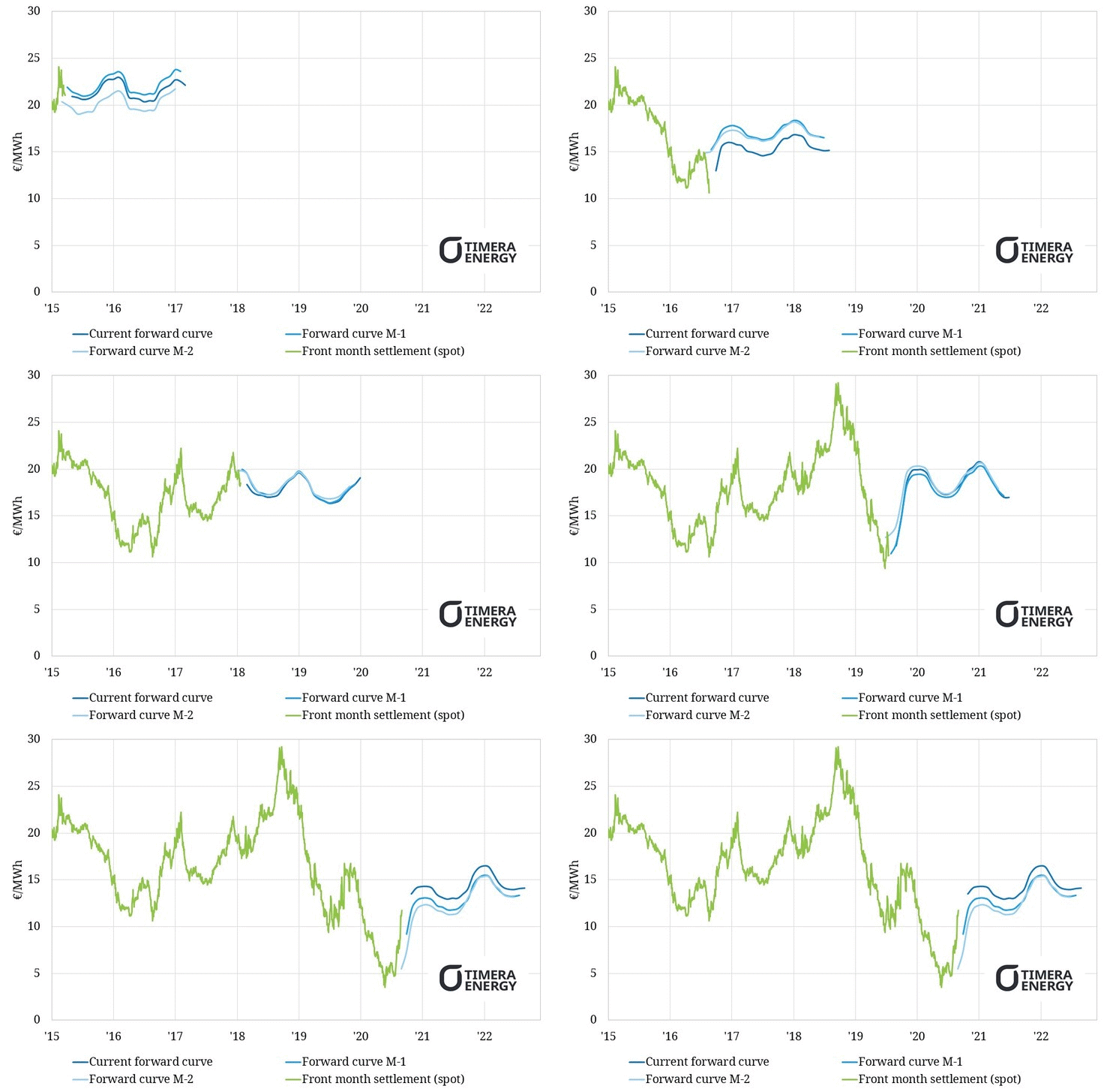
Chart 1 shows an animated view of the evolution of front month TTF prices (the green line) and the liquid front two years of the TTF forward curve (the dark blue line). To give a clearer view of shifts in the forward curve we also show the position of the forward curve for the two previous months (the lighter blue lines).
We include the 2015 to 2017 time horizon in the chart for context. We have shown this period in previous animations, so we ‘fast forward’ the animation through this period, before slowing the speed down from 2018.
The 2018 to 2020 period is an interesting case study of the anatomy of a gas market ‘mini cycle’ and the changing dynamics of spot versus forward prices. We have broken the action across this period into 3 separate horizons in our commentary below. We come back at the end to the implications of shifting price curve dynamics as a guide to what may happen next.
One suggested viewer tip: focus on the green spot price action in your first viewing, then focus on the blue forward curves in your second.
Watching the forward curves evolve is a bit like peering into a pit of writhing snakes… but it provides some valuable insights. It is the combination of spot & forward price dynamics that sheds light on the state of the market, but it can be a bit hard to absorb all in one viewing.
The 2018 squeeze
It was only two years ago that TTF prices peaked just under 30 €/MWh (10 $/mmbtu). This capped a doubling in European hub prices since the summer of 2017, with most of this rise ocurring across summer 2018.
Three key factors coincided to drive the 2018 summer squeeze in European gas prices:
- Low LNG import volumes given strong Asian LNG demand was pulling cargoes away from Europe
- Fuel switching dynamics where rising coal & carbon prices were pulling gas vs coal plant switching levels higher
- Russian flow constraints given imports from Russia were flowing at or near pipeline capacity constraints
All three drivers proved to be relatively short term in their impact. But the animation illustrates how in Jun to Aug 2018, both TTF spot prices and the forward curve ripped higher.
Across this period, the TTF forward curve saw both a jump in price levels and the development of steep backwardation (downward slope). The price jump coincided with a rapid bullish shift in the consensus market narrative. Higher spot prices fuelled expectations of ongoing tightness in European & Asian gas markets across a multi year horizon.
These market conditions flag the strong risk of an inflection or turning point, often reflecting capitulation of market players suffering from the price move higher. The summer 2018 conditions also mirror recent market behaviour in 2020, albeit with high price levels instead of low ones… but let’s come back to that after considering the 2019 price slump.
The 2019 flood of LNG
After the price squeeze of summer 2018, both the LNG market and European gas market were positioned for a tight winter. It never came.
Instead from Oct 2018 European LNG import volumes surged. Asian winter demand proved to be relatively weak at the same time as substantial volumes of new Australian, Russian & US LNG supply came to market. European power sector switching was the primary mechanism via which surplus LNG was absorbed.
This drove down spot prices from Sep 2018, dragging the forward curve down with it. By Q1 2019 (just 6 months after the 2018 peak), TTF prices had halved again, with the forward curve shifting from backwardation into contango as it fell.
By summer 2019, Europe was awash with surplus LNG and market focus had shifted to the potential shut in of US export volumes to clear the LNG and European gas markets.
TTF spot prices declined almost 90% across the 18 month period from Aug 2018 to Mar 2020. Most of that big move in spot prices took place in 2019. However throughout this spot price decline, the forward curve remained above 15 €/MWh. The more pronounced damage to forward prices did not come until 2020.
The 2020 Covid slump & recovery
Global gas demand slumped in Q1 2020 as lockdowns were rolled out. Spot gas prices unsurprisingly slumped as a result of this sudden demand shock. This is recent history so we won’t elaborate.
What has received less focus this year is the behaviour of the TTF forward curve. In Q1 the forward curve fell significantly, with prices pushed into steep contango (upward slope). At the same time the consensus market narrative shifted to a pervasively bearish view that Covid would crush global LNG and gas demand for years to come.
These conditions were a sort of ‘reverse mirroring’ of the market peaking conditions we described above in summer 2018. And sure enough there has been a sharp recovery in prices across the last three months.
TTF spot prices have tripled since the Apr 2020 (albeit from very low levels). But perhaps more interesting is the jump higher in both TTF spot prices and the TTF forward curve across the last 4 weeks, rapidly easing curve contango. Those are signals to us of an increasing probability that the market has bottomed and is embarking on an enduring recovery.
What happens next?
It seems that there were five drivers that the market may have underestimated as it plunged in the eye of the Covid storm in March:
- The rapid & high volume response of US export shut ins in relieving short term oversupply
- The impact of lower oil prices in curbing associated gas production (supporting Henry Hub prices)
- The resilience of Asian LNG demand to Covid, helped by demand response at low prices
- The pace of global economic & demand recovery from Covid, particularly given aggressive global fiscal & monetary stimulus
- The fact that the supply & demand balance in both the LNG and European gas markets was already pointing to a recovery across 2021-23, prior to the onset of Covid
Plenty of uncertainty remains as to how these factors will play out. But market prices appear to be flagging a major turning point. It is worth keep a close eye on TTF forward curve behaviour going forward for clues on what happens next.

