The evolution of generation margins for gas and coal fired power plants are having wide reaching implications across European gas and power markets this decade. A collapse in spark spreads (gas plant margins) over the last five years has seen CCGT load factors crushed and units closed or mothballed. This has in turn driven a pronounced decline in European gas demand, contributing to weakness in gas prices, seasonal spreads and volatility.
Dark spreads (coal plant margins) remained somewhat stronger until 2014, supported by falling coal prices. But the onset of price weakness at European gas hubs last summer has steadily eroded dark spreads.
Weak gas and coal plant margins are a key issue in the UK power market, with the threat of closure of 8-10 GW of thermal generation capacity over the next two years. The 2GW Eggborough coal plant last week became the latest station to announce it may close next year.
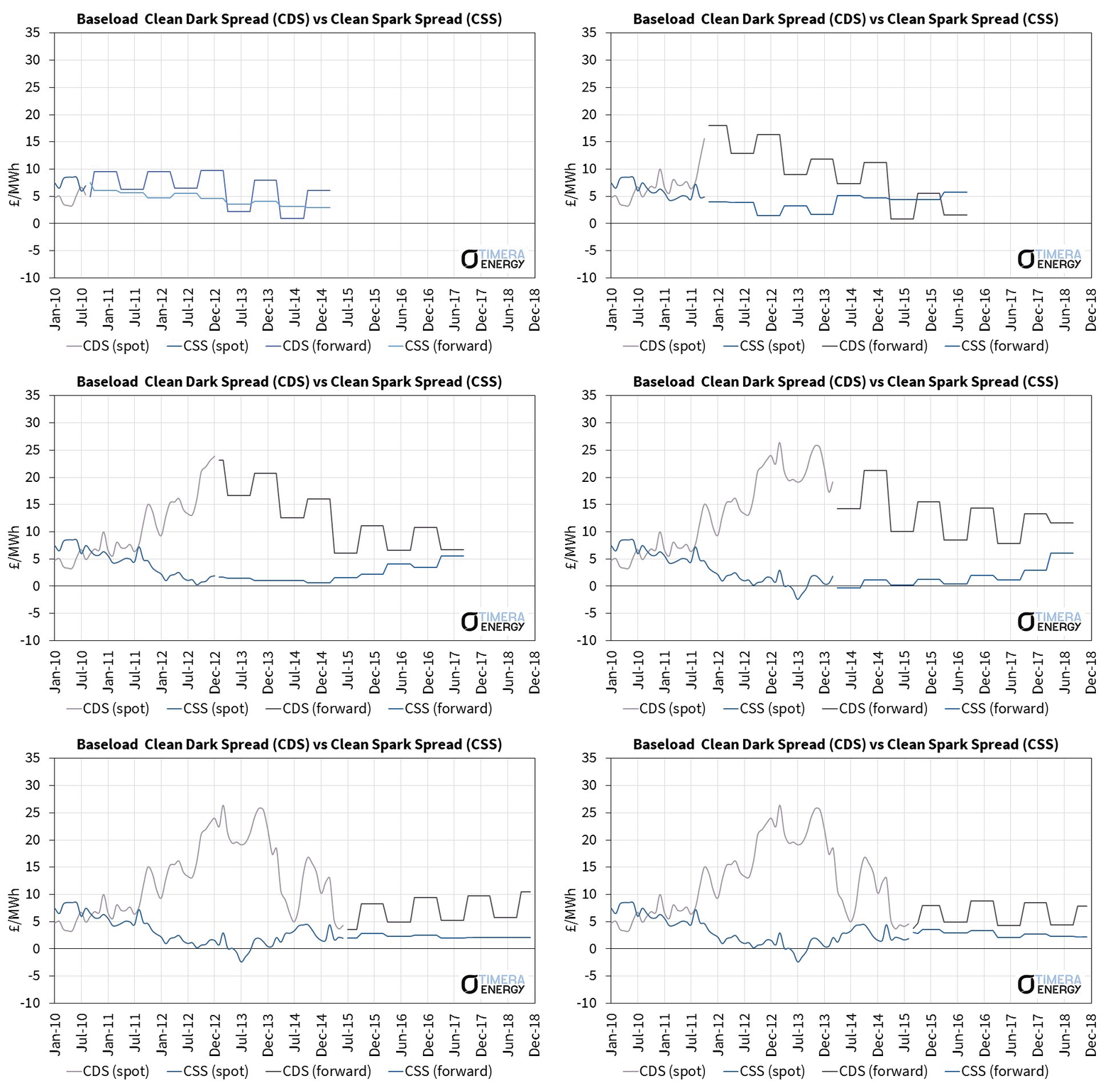
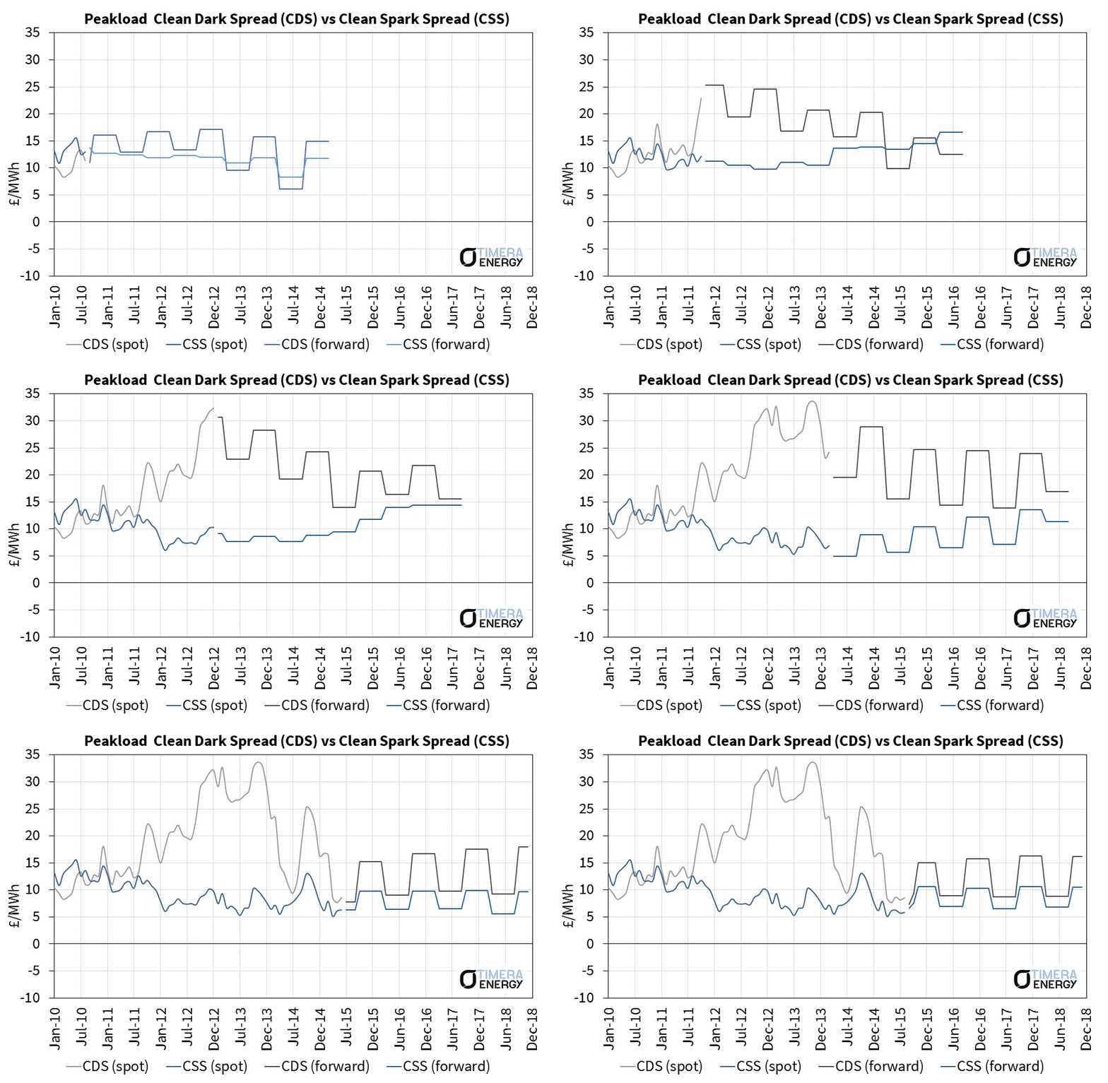
In order to investigate the dynamics of the evolution of clean spark and dark spreads (CSS & CDS), we have animated the evolution of spot vs forward spread curves. The approach we have used is similar to the previous animations we have done for the Brent crude curve and the NBP gas curve.
The reason why we like these curve animations is because they add a new dimension to the analysis of market price dynamics. Industry analysis is often very focused on spot prices. This is understandable given that spot prices drive asset dispatch decisions. But the majority of asset value is typically hedged against forward curve prices. An animation sheds light on:
- The relationship between spot vs forward price behaviour
- Forward price dynamics along different parts of the curve
- And in the case of generation margins, how spark spreads evolve relative to dark spreads
UK Baseload and Peakload spreads are shown in Charts 1 and 2 below. We will come back in a subsequent article to show CSS & CDS animations on the Continent.
Overview of spread dynamics
It is worth starting with a few observations about UK forward spread dynamics. The dominance of gas fired capacity in the UK power market (which has ~ 25GW of installed CCGT capacity) plays an important role in driving price evolution. Marginal power prices are predominantly set by gas fired plants, meaning there is a strong correlation between gas and power prices.
This provides strong support for Baseload CSS around the 0 £/MWh level and prevents pronounced negative spreads from occurring as seen in Continental power markets this decade (where coal plants set marginal prices). This logic has historically been used by trading desks to support spot vs curve strategies e.g. buying negative forward spreads to deliver into spot on the basis that gas plants on the margin should ensure spreads will be positive on delivery.
The dominance of gas plants in setting marginal prices also means the CSS curve has a less pronounced seasonal shape than the CDS curve. Both gas and power price curves have seasonal shape (which smoothes the CSS curve) whereas the CDS curve has a more pronounced shape given the absence of shape in coal forward prices.
Spread curves are also influenced by the contango (upward sloping) and backwardation (downward sloping) dynamics of the underlying fuel, carbon and power price forward curves. For example, the steep backwardation that can be seen in the UK CDS curve in 2013 is a function of strong coal and carbon curve contango.
But perhaps the most important observation about price behaviour from the animation is that spot spreads have a very strong influence on CSS and CDS forward curves. This is often referred to as ‘the prompt wagging the curve’. We have explored this dynamic in previous articles, but in the UK power market it is also a function of relatively weak liquidity. With the market dominated by vertically integrated utilities, liquidity is normally restricted to the front three seasons (and is often limited within this time horizon).
Coal vs gas plant margin behaviour
From 2011 to 2013, a gap opened up between coal and gas plant margins. This was driven by relative fuel price movements. Across this period, gas prices remained broadly linked to oil (above 100 $/bbl). Whereas the onset of oversupply in the global coal market saw coal prices decline more than 50%.
Coal-fired plants opened up a large competitive advantage over gas-fired plants. This pushed older less efficient CCGTs out of merit, causing the weakening of spark spreads that can also be seen from 2011-13.
Two factors have rapidly changed the fortunes of UK coal fired-plants since 2013:
- The carbon price floor has been increased to 18 £/t, adding a substantial carbon cost on top of EUA certificates
- NBP gas prices have declined as oil prices have fallen and an oversupplied LNG market has set in
The current forward CDS curve sits barely above the CSS curve. Yet the fixed costs of coal-fired plants (~ 50 £/kW) are roughly double those of CCGTs (~ 25 £/kW). In other words less efficient coal plants are running at negative margins. This is the primary driver of the announced closures of around 5GW of coal capacity in the UK (Longannet, Eggborough, Ferrybridge). While these closures are consistent with the previous UK government’s carbon price floor policy intentions, they are pushing the UK power market into a period of unprecedented capacity tightness.
Spread curves are not pricing in a capacity crunch
If the threatened plant closures materialise, National Grid’s measure of UK system reserve margin is likely to swing into negative territory over the next two winters. The forward market appears remarkably complacent about this.
There was a pronounced contango (upward slope) that developed in the peak and baseload CSS curves through 2012-13. This was in part a function of backwardation in the gas forward curve, but also reflected power prices increasing along the curve in anticipation of the system capacity margin tightening. The animation illustrates how this CSS contango (particularly peak CSS) has been flattened since summer 2014. Again this relates in part to the reversal of NBP gas curve contango, but the current UK forward spread curves are not pricing in any recovery in generation margins despite a looming capacity crunch.
So why is there no market price signal emerging to encourage thermal plants to remain open? If you take a cynical view of UK power market regulation, you can argue that the market anticipate ssome form of regulatory intervention will prevent a capacity crunch come what may. But in our view that is not the whole story.
The number of more speculative trading desks taking an active view on forward UK power price evolution is declining, given capital constraints and the winding down of energy trading functions at banks. This means weaker liquidity along the curve with the forward market dominated by utilities and generators.
These conditions suggest that there is ‘prompt wagging the curve’ logic in play. In practice this is likely to be caused by weaker prompt spreads causing generators to maintain or even increase their forward hedge cover to protect downside exposure, rather than lifting hedges in anticipation of higher margins in the future. As a result the market price signal from the onset of a capacity crunch is likely to be seen first in spot prices and it may happen very rapidly.
Article written by David Stokes, Olly Spinks & Emilio Viudez Ruido.


